roc curves
Receiver operating characteristic (ROC) curves are great visualizations.1 I also found them quite confusing when I first encountered them. I’m going to take a little time to write down why I like them and how they work, in the hopes that the act of writing is helpful for me to clarify my own intuitions and that the result is helpful for at least one other person who is still developing intuition for ROC curves.
Before I get into why I like these curves, let’s turn to how we make them. The important thing to understand about a ROC curve is that it represents the outcome of a somewhat tedious and laborious process that is not well captured by the graph itself.
Here’s the process:
-
Identify a binary classification problem. (Cat or dog? Black or white? Benign or malicious?)
-
Build a classifier for that problem. We assume that all the data our classifier sees falls into one of those two buckets.
Example: In my work, the labels are benign (labeled 0) and malicious (labeled 1). Our classifier outputs its confidence that the sample’s label is 1. So an output of 0.2 represents the classifier having 20% confidence that the sample is malicious.
- Evaluate the classifier on a held out test set. We know the ground truth labels for the data in the test set, of course, and we’re trying to see the extent to which the classifier agrees with ground truth.
Example, continued: Suppose, as before, benign = 0, malicious = 1, and our classifier assigns scores corresponding to the probability of the sample being malicious. Suppose the actual labels of the five samples in the test set are [1, 0, 1, 0, 0]. Then a classifier might return predictions like [0.4, 0.7, 0.9, 0.1, 0.2].
- Sort the data in ascending order by the scores assigned by the classifier.
Example, continued:
predictions:   [0.1, 0.2, 0.4, 0.7, 0.9]
ground truth:  [0.0, 0.0, 1.0, 0.0, 1.0]
- Pick a representative threshold for each gap in the predictions (midpoints are fine).
Example, continued:
thresholds: [0.05, 0.15, 0.3, 0.55, 0.8, 0.95]
- FINALLY, start producing points for the ROC curve. For every threshold in our list, we perform a two step process.
- Binarize according to the threshold. Scores above the threshold go to 1; scores below the threshold go to 0.
- Compute the false positive rate (FPR) and true positive rate (TPR) for that threshold.
Example, continued. Let’s work out the math by hand.
Threshold: 0.05
- Binarized predictions:
[1, 1, 1, 1, 1] - Ground truth:
[0, 0, 1, 0, 1]
| Actually positive | Actually negative | |
|---|---|---|
| Predicted positive | 2 | 3 |
| Predicted negative | 0 | 0 |
- FPR = false positives / actually negative = 3 / 3 = 1.0
- TPR = true positives / actually positive = 2 / 2 = 1.0
Point on the ROC curve: (FPR, TPR) = (1.0, 1.0)
Threshold: 0.15
- Binarized predictions:
[0, 1, 1, 1, 1] - Ground truth:
[0, 0, 1, 0, 1]
Confusion matrix:
| Actually positive | Actually negative | |
|---|---|---|
| Predicted positive | 2 | 2 |
| Predicted negative | 0 | 1 |
- FPR = 2 / 3 = 0.67
- TPR = 2 / 2 = 1.0
Point on the ROC curve: (0.67, 1.0)
Threshold: 0.3
- Binarized predictions:
[0, 0, 1, 1, 1] - Ground truth:
[0, 0, 1, 0, 1]
Confusion matrix:
| Actually positive | Actually negative | |
|---|---|---|
| Predicted positive | 2 | 1 |
| Predicted negative | 0 | 2 |
- FPR = 1 / 3 = 0.33
- TPR = 2 / 2 = 1.0
Point on the ROC curve: (0.33, 1.0)
Threshold: 0.55
- Binarized predictions:
[0, 0, 0, 1, 1] - Ground truth:
[0, 0, 1, 0, 1]
Confusion matrix:
| Actually positive | Actually negative | |
|---|---|---|
| Predicted positive | 1 | 1 |
| Predicted negative | 1 | 2 |
- FPR = 1 / 3 = 0.33
- TPR = 1 / 2 = 0.5
Point on the ROC curve: (0.33, 0.5)
Threshold: 0.8
- Binarized predictions:
[0, 0, 0, 0, 1] - Ground truth:
[0, 0, 1, 0, 1]
Confusion matrix:
| Actually positive | Actually negative | |
|---|---|---|
| Predicted positive | 1 | 0 |
| Predicted negative | 1 | 3 |
- FPR = 0 / 3 = 0.0
- TPR = 1 / 2 = 0.5
Point on the ROC curve: (0.0, 0.5)
Threshold: 0.95
- Binarized predictions:
[0, 0, 0, 0, 0] - Ground truth:
[0, 0, 1, 0, 1]
Confusion matrix:
| Actually positive | Actually negative | |
|---|---|---|
| Predicted positive | 0 | 0 |
| Predicted negative | 2 | 3 |
- FPR = 0 / 3 = 0.0
- TPR = 0 / 2 = 0.0
Point on the ROC curve: (0.0, 0.0)
Let’s plot these points.
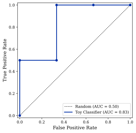
Cool, right? The most important metric to extract is in the lower right corner of the plot: the area under the ROC curve (AUROC). AUROC is the best finger-to-the-wind measure of a classifier’s overall quality. The extremal cases are AUROC = 0.5 and AUROC = 1.0. An AUROC of 0.5 indicates a classifier that is no better than random chance. No matter what threshold we choose, the classifier cannot distinguish between the two classes. An AUROC of 1.0 corresponds to a perfect classifier. Even at a false positive rate of zero, the classifier maximizes the true positive rate. This corresponds to the existence of a threshold that perfectly splits all of the classifier’s negative and positive predictions.2
The closer our AUROC is to 1.0, the better our classifier is. And note that this is true no matter what the optimal threshold is. AUROC lets us compare classifiers with different optimal thresholds on the same scale.
Here’s a little embedded demo you can mess around with to test your intuitions. Add more rows of data, make the classifier worse/better, see the new points on the curve get rendered, etc.
Other than calculating the AUROC, what is this plot good for? It lets us answer a question like this: “If I’m only willing to accept a false positive rate of X, how good can my true positive rate Y be, assuming I calibrate my threshold correctly?” This is a GREAT question to be able to answer. In a monitoring setting, false positives are generally pretty costly to deal with, because whatever intervention we trigger on any positive is probably expensive or time-consuming. Therefore, we want to hold our false positive rate way down (1% is a good upper bound on a deployment FPR) and design classifiers to be good at that low false positive rate. Replacing a classifier that achieves a TPR of 1.0 at a 0.05 FPR with a better classifier that achieves a TPR of 1.0 at a 0.01 FPR can cut the relative number of false positives we have to deal with by a factor of five. Huge win for the program. 
Hope you’re now on the ROC curve bandwagon with me 🙃
-
I now feel pretty dumb I didn’t catch this before, but the name actually tells you a bunch about what’s going on if you hear it in historical context. These kinds of curves emerged from radar signal detection work done during/after the second World War, where it was important to know how well your receiver (radar system) was operating (helping you spot the bad guys but not freaking you out with excessive false alarms). (NB: This guy seems to have written the best blog post about the actual history of ROC curves; check it out if you’re interested.) After reading this piece, I hope that the idea that seeing a radar system’s ROC curve and using that to infer how likely the blips produced by that system are likely to be real adversaries or false alarms feels natural. ↩
-
As long as you can split the positive and negative predictions, it kind of doesn’t matter whether the positive predictions cluster near 0 and the negative predictions cluster near 1 – just flip the ground truth labels and you’re back to being perfect. ↩